Blog May 21, 2018
How to give your audience a seamless mobile experience

It is not strange to hear that users are dissatisfied with a website because it doesn’t load properly on their mobile phones. Often, companies forget that a seamless and smooth mobile experience is as important as a smooth desktop experience. Here is how you can ensure your brand’s mobile website is perfect and exactly what the user is looking for.
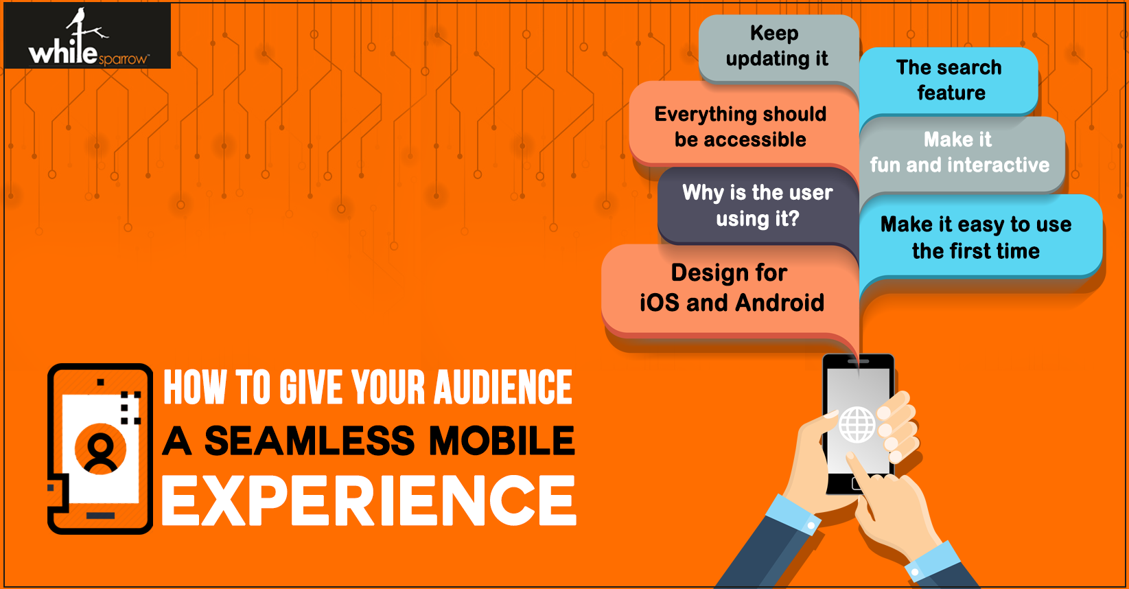
Design for iOS and Android
The designs for iOS and Android are different, simply because the interfaces are different, and the backend is different. Everything from the design of the logo to the placement of the home button can change when switching between these to operating systems. Therefore, make sure your website is designed to load on both types of smartphones.
Make it easy to use the first time
Making a good first impression is essential, so eliminate the clutter from your home page. Present the user with only the necessary information and guide them towards downloading your app or opening your website in the shortest way possible.
Why is the user using it?
Understand why the user is currently using your website on their smartphone. Understanding your target market and their requirements will help you design the website better. Your mobile website does not need to be as detailed as your desktop website if less information does the trick.
Make it fun and interactive
The user’s experience should be interesting, to say the least. This is the only way they will keep coming back to your website. The interactive design captures the user’s attention and makes your brand stand out from the crowd. Communicating with the user via fun icons and actions on the mobile website is instrumental to engage them.
Everything should be accessible
The thing most users hate about mobile websites is the lack of accessibility. They click on search but they end up opening the services page. They click on home but end up on the FAQs page. Make sure your design avoids these common pitfalls. Make the most commonly used call to action buttons easily visible and easy to use.
The search feature
Compared to a full website, a mobile website has much less screen space to display all the essential information. Users are not likely to keep scrolling and scrolling until they arrive at the section they are looking for. A better idea is to somehow incorporate the search function on the mobile website. This makes it easier for them to access information and removes the problem of pointless scrolling.
Keep updating it
Testing your website with a focus group is essential before you launch it. And once you launch it, it is important to update your website if OS updates deem it necessary. Gather data, conduct A/B testing, to find out if the mobile website is up to the expectations of the user.
Smartphones are in our hands almost every second of the day. Therefore, it makes sense that companies and brands invest time and effort into making sure a user’s mobile experience is just as great as their overall experience with the company’s website.


